

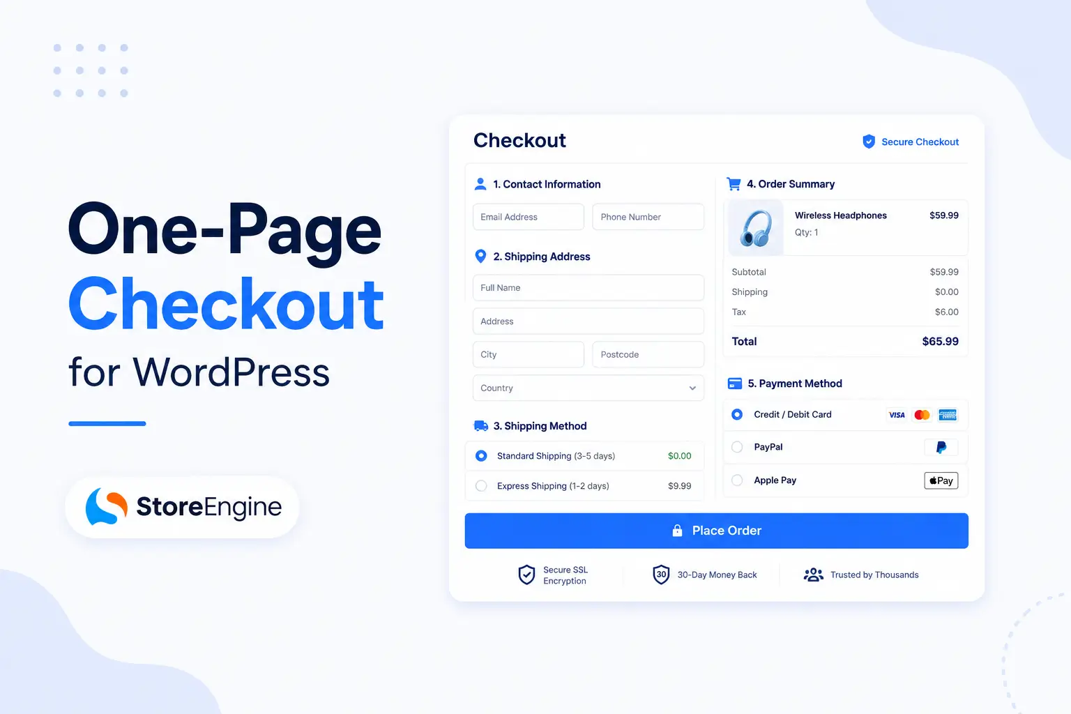

Checkout friction is one of the most common reasons online stores lose sales. A customer adds a product to their cart, gets excited about the purchase, and then hits a wall of forms, page reloads, and confusing steps. By the time they reach the payment page, they’ve already lost patience—and in many cases, they simply close the tab and move on.
These are some of the most common reasons customers abandon their carts before completing a purchase. Long checkout flows, unexpected shipping costs, and clunky mobile experiences all chip away at conversions. Every extra field to fill out or page to wait for is another opportunity for customers to leave.
As a result, many WordPress store owners are adopting one-page checkout to simplify the buying process. Instead of guiding shoppers through multiple steps, it brings everything into a single, streamlined page. By reducing checkout friction, it can improve the shopping experience and help increase conversions.
In this article, you’ll learn what a one-page checkout is, why checkout design affects conversions, its key benefits, the features to look for, best practices, common mistakes to avoid, and how it fits into a WordPress sales funnel.
What Is One-Page Checkout?
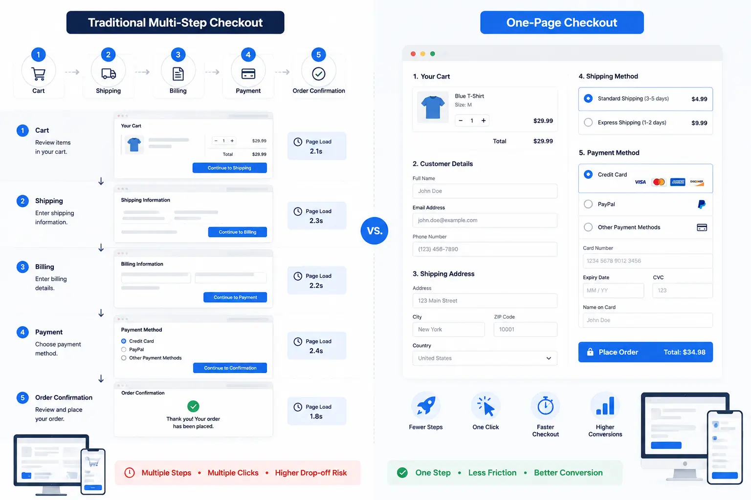
One-page checkout is exactly what it sounds like: a checkout process condensed into a single page instead of spread across multiple steps. Customers can view their cart, enter shipping details, choose a payment method, and complete their purchase without navigating between separate pages — a foundational piece of a well-optimized WordPress checkout process.
By reducing unnecessary clicks, page loads, and distractions, one-page checkout creates a faster and more convenient buying experience. This streamlined approach helps customers stay focused on completing their purchase instead of navigating through multiple checkout screens.
Traditional Checkout vs One-Page Checkout
Traditional WooCommerce-style checkouts often involve several steps—cart review, shipping information, billing details, and payment—each requiring a page load. Customers move forward one screen at a time, often re-entering or confirming information along the way. Every extra click or page transition is another opportunity for customers to lose interest, get distracted, or abandon their purchase.
Multi-step checkouts can still be useful for complex stores, but for many online businesses, modern web technologies make a streamlined one-page checkout a practical alternative.
One-page checkout helps reduce these barriers by bringing everything into a single, streamlined page. Customers can view their cart, enter their details, choose a payment method, and complete their purchase without unnecessary page transitions. This creates a smoother checkout experience and can help reduce hesitation during the buying process.
How Instant Checkout Works
Instant checkout takes this a step further by minimizing form fields, auto-filling known information when available, and supporting faster payment methods, including one-click payments where supported.
This often includes smart defaults, such as pre-filling customer information when available and displaying relevant payment methods automatically. The goal is to shorten the time between “I want this” and “I bought this,” making it easier for customers to complete their purchase with minimal friction.
Why Checkout Pages Affect Conversion Rates
Checkout is often the final hurdle before a sale, making it one of the most critical stages of the buying journey. Even small sources of friction can discourage customers from completing their purchase.
- Too many steps. Each additional page or click adds friction and gives customers more opportunities to reconsider or abandon their purchase.
- Long forms. Asking for excessive information can make checkout feel time-consuming, especially on mobile devices.
- Page reloads. Slow transitions between checkout steps can frustrate customers and make the process feel longer than it actually is.
- Mobile usability. With a large share of online shopping happening on mobile devices, a checkout that isn’t optimized for smaller screens can lead to higher abandonment rates.
- Unexpected costs. Surprise shipping fees, taxes, or other charges revealed late in the checkout process are among the most common reasons customers abandon their carts.
Together, these factors show why checkout design has such a direct impact on conversion rates. Checkout is where purchase intent turns into action, and reducing unnecessary friction can make it easier for customers to complete their orders. That’s why optimizing your checkout is an important part of building a sales funnel for WordPress.
Benefits of One-Page Checkout
When done well, one-page checkout addresses many of the friction points mentioned above.
Faster purchase experience. Customers can complete their order in fewer steps, which feels quicker and more convenient.
Lower cart abandonment. Fewer distractions and less back-and-forth mean fewer chances for customers to abandon their cart midway.
Better mobile experience. A single, well-designed page is often easier to navigate on a small screen than multiple separate steps.
Fewer distractions. With everything on one page, customers can focus entirely on completing their purchase.
Higher conversion rate. By removing unnecessary friction, stores often see more visitors follow through to a completed sale.
Does One-Page Checkout Really Increase Conversions?
This is the question every store owner wants answered clearly—and the honest answer is that it depends.
Results can vary based on a few key factors:
- Store type. A store selling a single product may benefit more from a compact one-page layout than a store with complex bundles or subscriptions.
- Product complexity. Items requiring customization, variants, or multiple options may need slightly more space to present clearly, even within a one-page format.
- Checkout optimization. A one-page checkout that’s poorly designed, slow, or cluttered won’t outperform a well-optimized multi-step checkout.
Many online stores report better checkout completion rates after simplifying their checkout process. That said, results vary depending on the implementation, target audience, and how well the checkout is tested and refined over time. One-page checkout is a strong foundation, but it delivers the best results when it’s part of a well-optimized conversion-focused WordPress sales funnel.
Features to Look for in a WordPress One-Page Checkout
Not all one-page checkout solutions are built the same. When evaluating options for your WordPress store, look for:
- Clean design that keeps the focus on completing the purchase
- Guest checkout, so customers aren’t forced to create an account
- Multiple payment methods to accommodate different customer preferences
- Mobile responsive layouts that adapt smoothly to smaller screens
- Fast loading performance, since delays undo the benefits of a simplified flow
- Coupon support for stores that run promotions
- Order summary that’s clear and visible throughout the process
- Secure payments to build trust and protect customer data
A checkout solution that combines these features gives customers a smooth, confidence-inspiring path to purchase.
How StoreEngine Makes Instant Checkout Easy
For WordPress store owners looking to implement a simplified checkout without extensive custom development, StoreEngine offers a practical option.
StoreEngine’s Instant Checkout feature is designed around the same principles discussed above: fewer steps, less friction, and a smoother path to purchase. The checkout layout is optimized to keep customers focused, with support for popular payment gateways like Stripe and PayPal built in.
Performance matters too, and StoreEngine is built for fast loading times, which helps prevent the kind of delays that cause customers to abandon checkout. The experience is also mobile friendly, ensuring shoppers on phones and tablets get the same smooth process as desktop users.
For store owners using the WordPress block editor, StoreEngine offers Gutenberg compatibility, making it easier to customize checkout pages without touching code. Overall setup is designed to be straightforward, with easy configuration that doesn’t require extensive technical knowledge to get a working checkout live.
These features make it simpler for WordPress stores to offer a streamlined checkout experience without building one from scratch.
Best Practices for Maximizing Checkout Conversions
Even with a good checkout solution in place, small optimizations can make a meaningful difference.
- Reduce form fields to only what’s necessary for completing the order
- Show trust badges near the payment section to reassure customers
- Display shipping costs early, ideally before the final payment step
- Offer guest checkout so account creation doesn’t become a barrier
- Optimize page speed, since every second of delay increases the chance of drop-off
- Test on mobile regularly, as this is where many purchases now happen
- Avoid unnecessary distractions, such as pop-ups or unrelated links during checkout
None of these practices require a complete redesign. Many can be implemented incrementally, tested against real customer behavior, and refined over time. Together, they work alongside a one-page layout to create a checkout experience that’s genuinely easier to complete, rather than just visually simpler.
Common Mistakes to Avoid
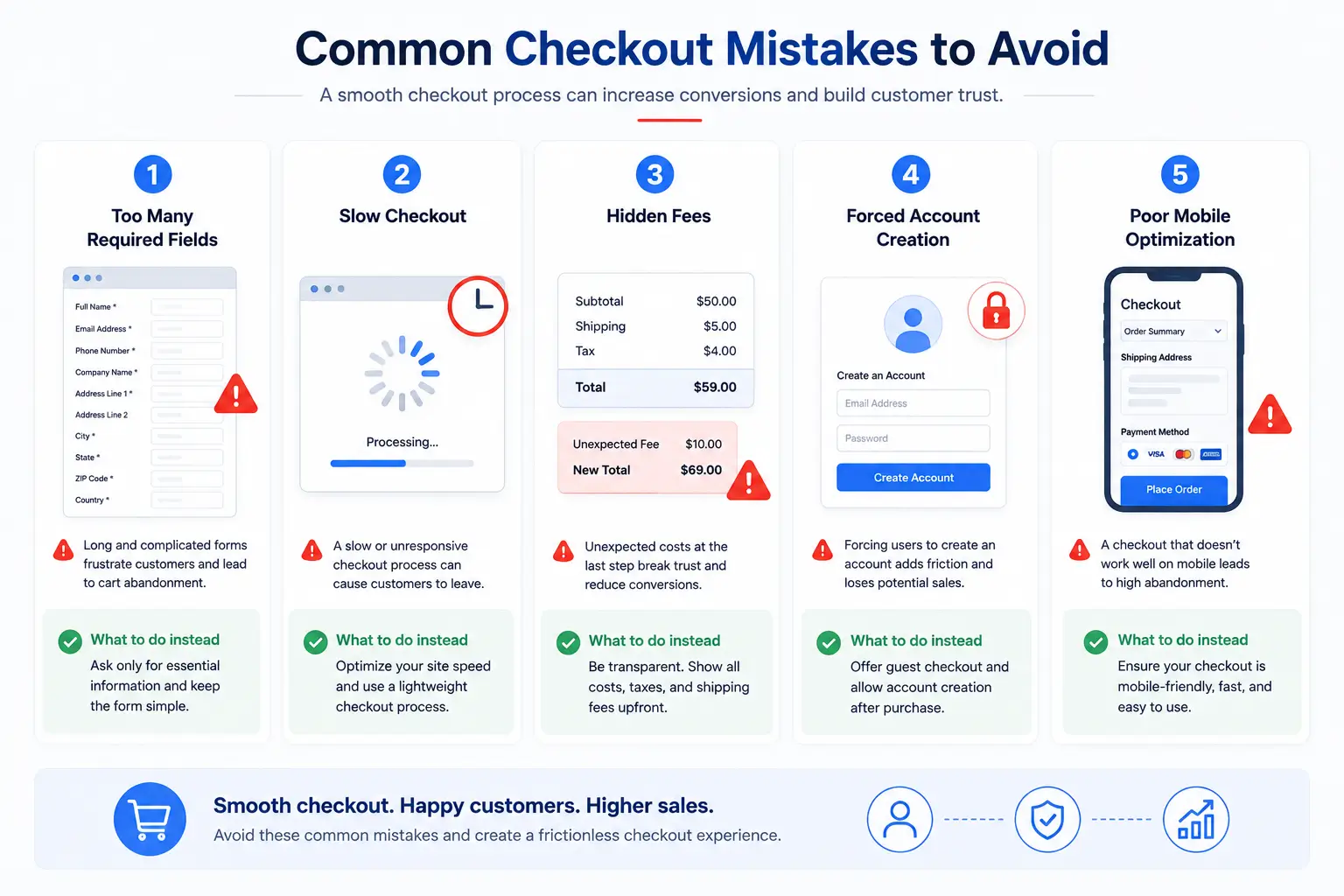
Just as important as knowing what to do is knowing what to avoid.
- Too many required fields, which makes checkout feel like a chore
- Slow checkout, which frustrates customers regardless of how few steps there are
- Hidden fees, which erode trust and often lead to last-minute abandonment
- Forced account creation, which adds an unnecessary barrier for first-time buyers
- Poor mobile optimization, which alienates a large portion of potential customers
Avoiding these pitfalls is often just as valuable as adopting a one-page format in the first place. A single-page layout with hidden fees or a forced login screen won’t perform any better than a multi-step checkout with the same problems — the format alone isn’t a fix for deeper usability issues.
Conclusion
A simpler checkout creates a better overall experience for customers, and that experience directly affects whether they complete their purchase. Faster, more streamlined checkout flows can reduce cart abandonment and help improve conversion rates.
That said, the biggest gains typically come from optimizing the entire checkout experience—not just reducing the number of pages. Clear design, fewer distractions, transparent pricing, and mobile-friendly layouts all play an important role in building an effective WordPress sales funnel.
For WordPress store owners looking to simplify this process, StoreEngine’s Instant Checkout feature offers a practical way to provide a streamlined purchasing experience without building a custom solution from the ground up.
FAQs
What is one-page checkout?
One-page checkout is a checkout process where customers can view their cart, enter shipping and payment details, and complete their purchase all on a single page, instead of moving through multiple separate steps.
Does one-page checkout increase conversions?
It can, especially when it reduces friction like long forms and unnecessary page loads. However, results depend on how well the checkout is designed, the type of store, and the products being sold.
Is one-page checkout better than multi-step checkout?
Not always. One-page checkout tends to work well for simpler purchases, while multi-step checkout can sometimes help organize more complex orders. The best choice depends on your store and customer base.
Can I use one-page checkout in WordPress?
Yes. Various plugins and tools, including StoreEngine, allow WordPress store owners to set up a one-page or instant checkout experience without extensive custom development.
Does StoreEngine support instant checkout?
Yes. StoreEngine includes an Instant Checkout feature designed to simplify the purchase process, with support for Stripe and PayPal, mobile-friendly design, and Gutenberg compatibility.